Mobile homepage "wall" facelift
I really like “the wall” on our home page, its one of the best looking things on the website and its super fun to explore. Just watching the albums scroll behind or in front of the logo is super satisfying to me. It was also one of the most unpleasant things to code!
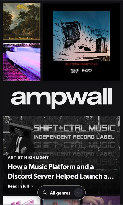
If you’re uncertain exactly how it works (as I don’t think we’ve ever explained it): we pull 100 of the latest releases (so, things with recent release dates. not uploaded dates), one per artist/label, shuffle them and distribute randomly in a grid until it takes up 2x the height of your monitor (up to a certain point, super tall monitors might not get this experience). This way every homepage looks different for everyone, everyone’s albums have an equal chance of appearing on the page, and there aren’t so many releases at once it’s taxing to look at or impossible pick one out.
Onto the news: the mobile (web only, not the app) home page has gotten a pretty significant facelift! It used to be the exact same as the desktop view, just constrained to your devices size. This led to some pretty awkward looking landing pages as they could be pretty empty looking on a bad layout. Now, it will generate a mosaic of albums rather than a grid with empty spaces. The mosaic should be about 5x the length of your devices screen, so it still has quite a lot to look at. Things are still placed randomly so it keeps the fun vibes I think the full desktop view has! Check it out: